
Fillups
Services
App Design
UI/UX
User Flows
Industry
Professional Services
CHALLENGE: Fillups set out to modernize the gas station experience by blending fuel, food, and convenience into one seamless mobile platform. The vision was bold: capture the nostalgic feel of a 1950s service station while delivering the speed and functionality today’s users expect. The client needed more than just a sleek interface—they needed a fully thought-out user journey that could guide drivers from dashboard to pump to checkout without friction. We were tasked with designing a brand identity, UI system, and app architecture that brought this vision to life across every screen.
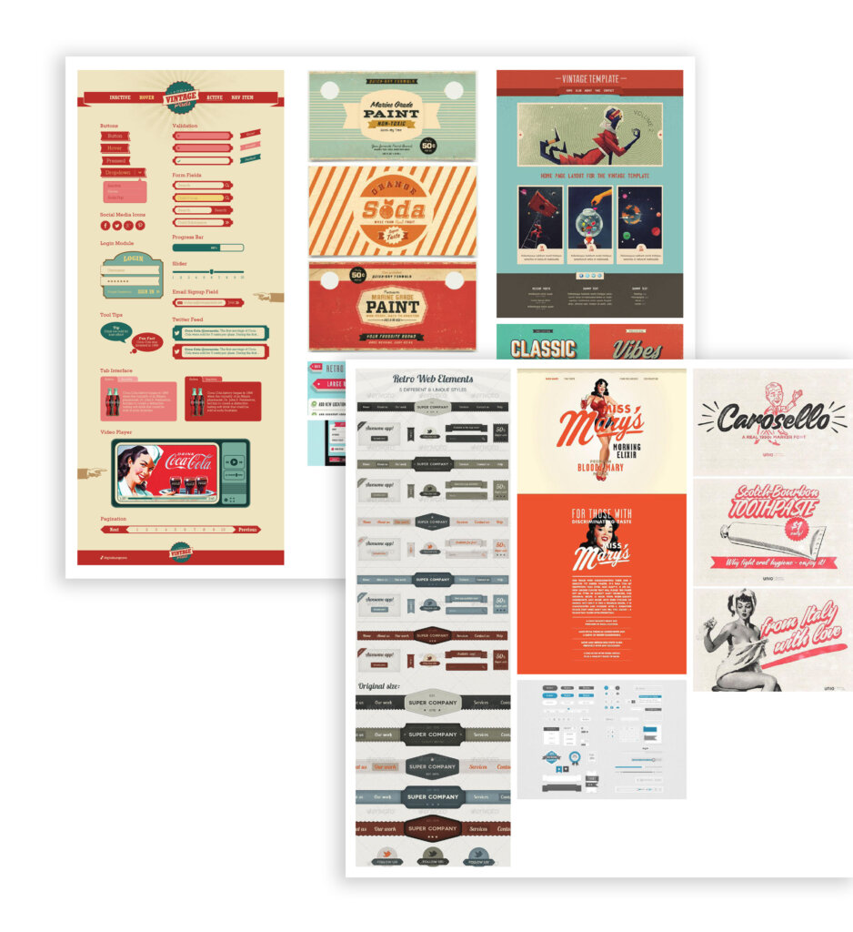
SOLUTION: RocketDog, along with JacobTyler, started with a strategy-first approach—starting with mood boards and wireframes that shaped the look, feel, and flow of the app. We drew from retro Americana for visual inspiration, using chrome accents, red-and-silver tones, and vintage typography to establish a warm, throwback identity rooted in service and trust.
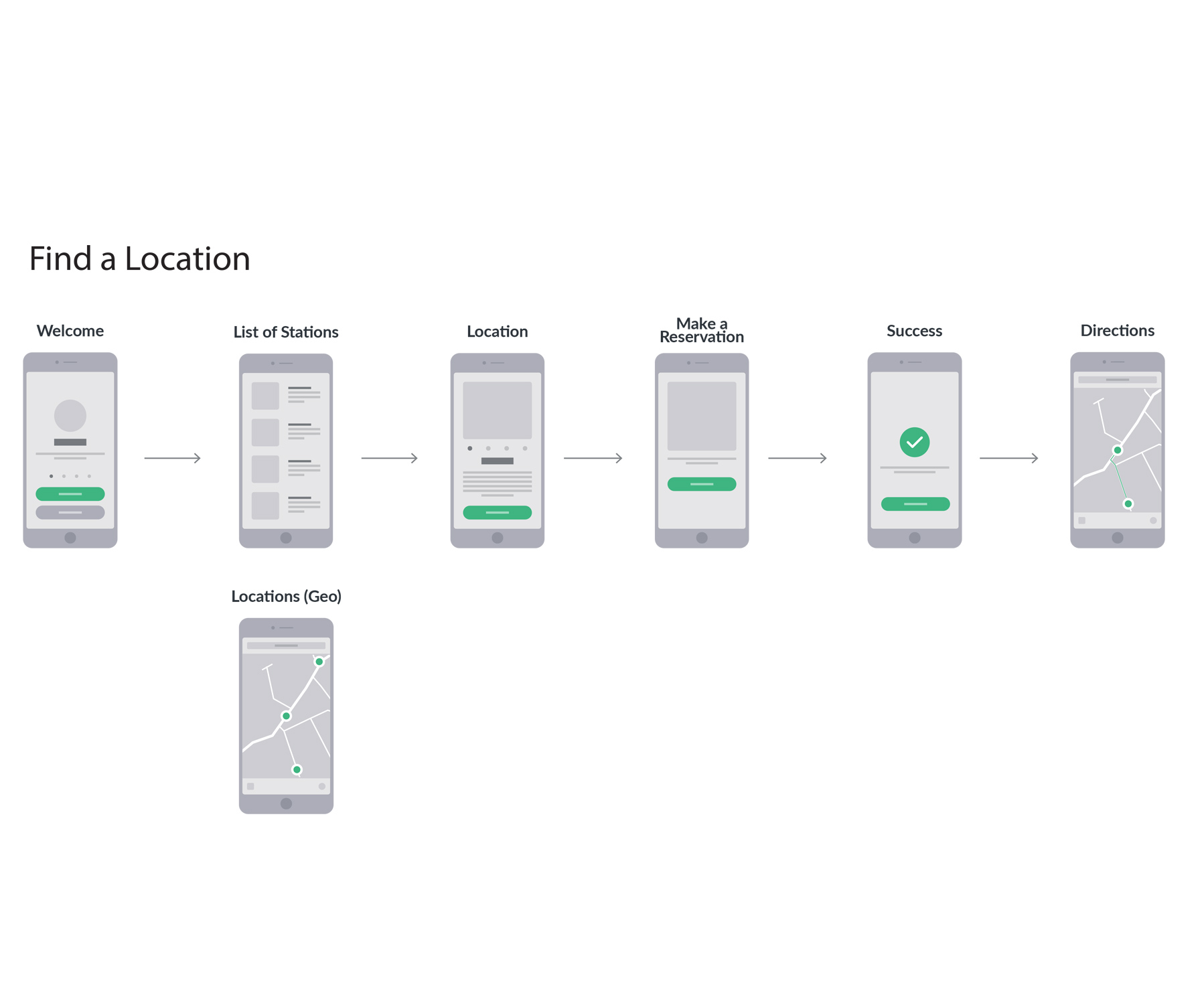
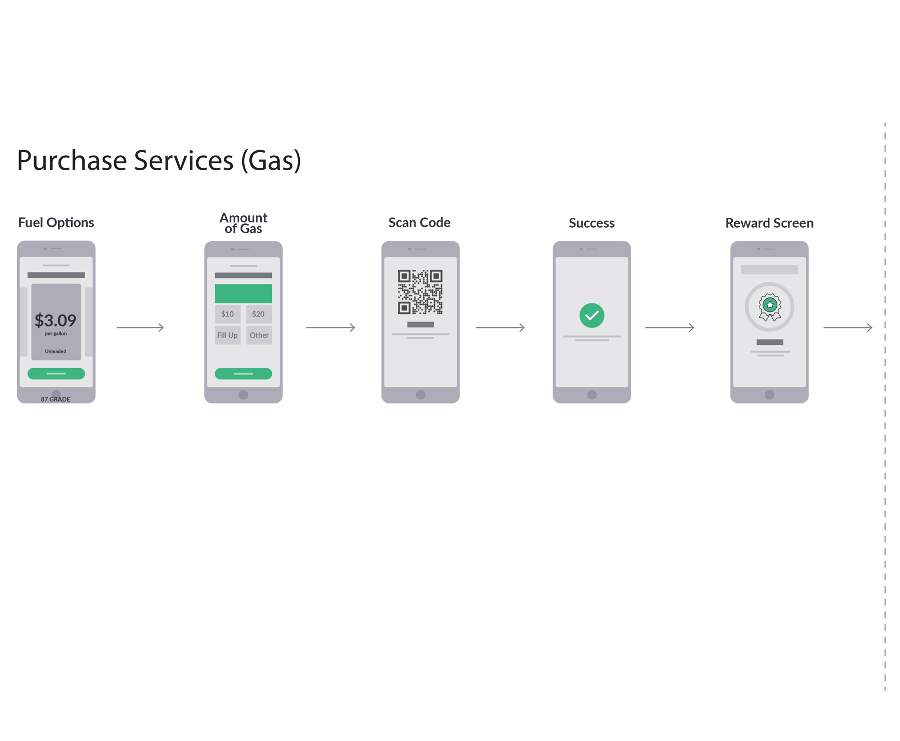
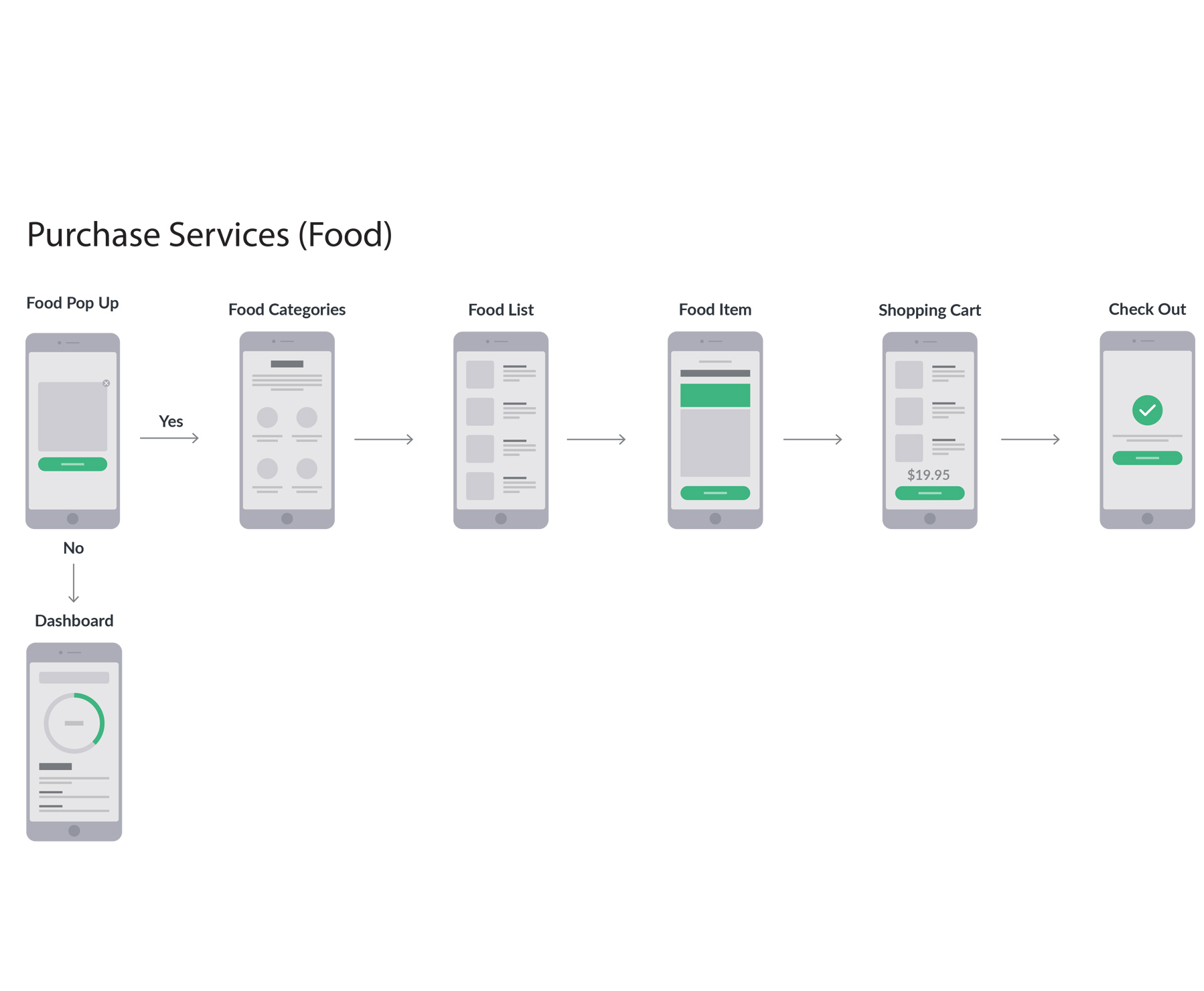
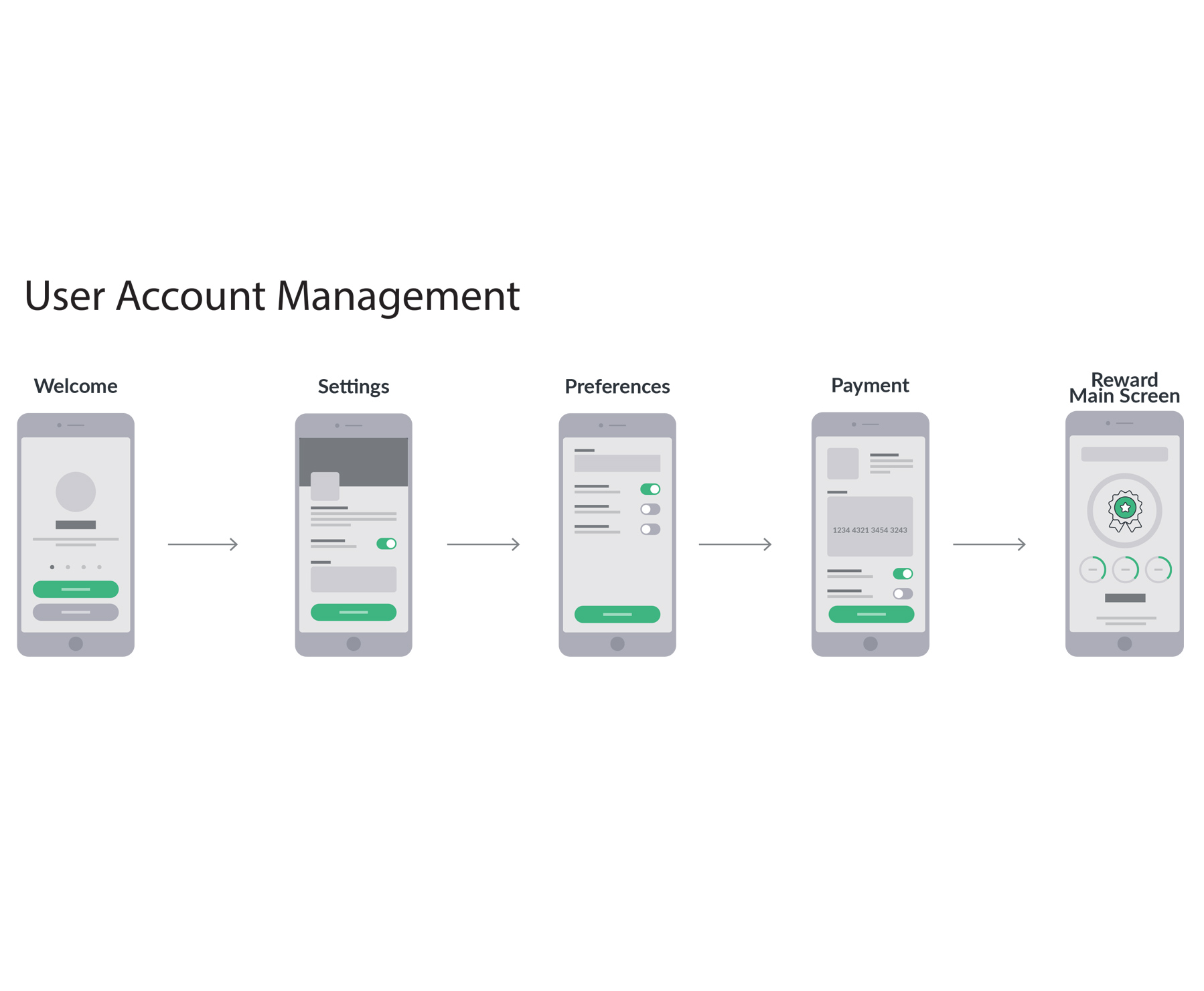
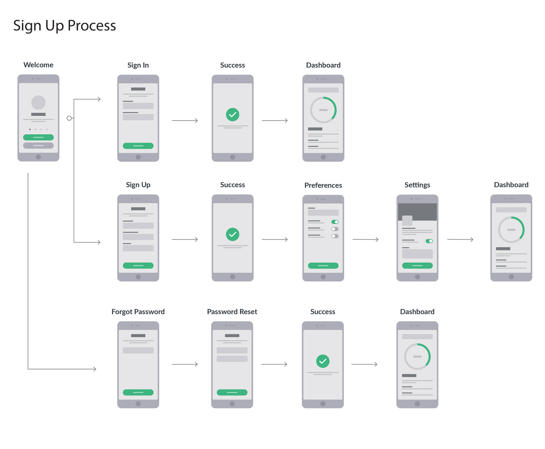
We designed intuitive user flows that prioritized ease-of-use for drivers in motion: large tap targets, simplified menus, and logical sequencing kept things moving. Visually, the UI balances nostalgic design cues with crisp modern layout principles. From location search to food ordering to payment confirmation, the entire experience was engineered for clarity, efficiency, and charm. The result is an app that feels both familiar and fresh—evoking the past while driving toward the future.
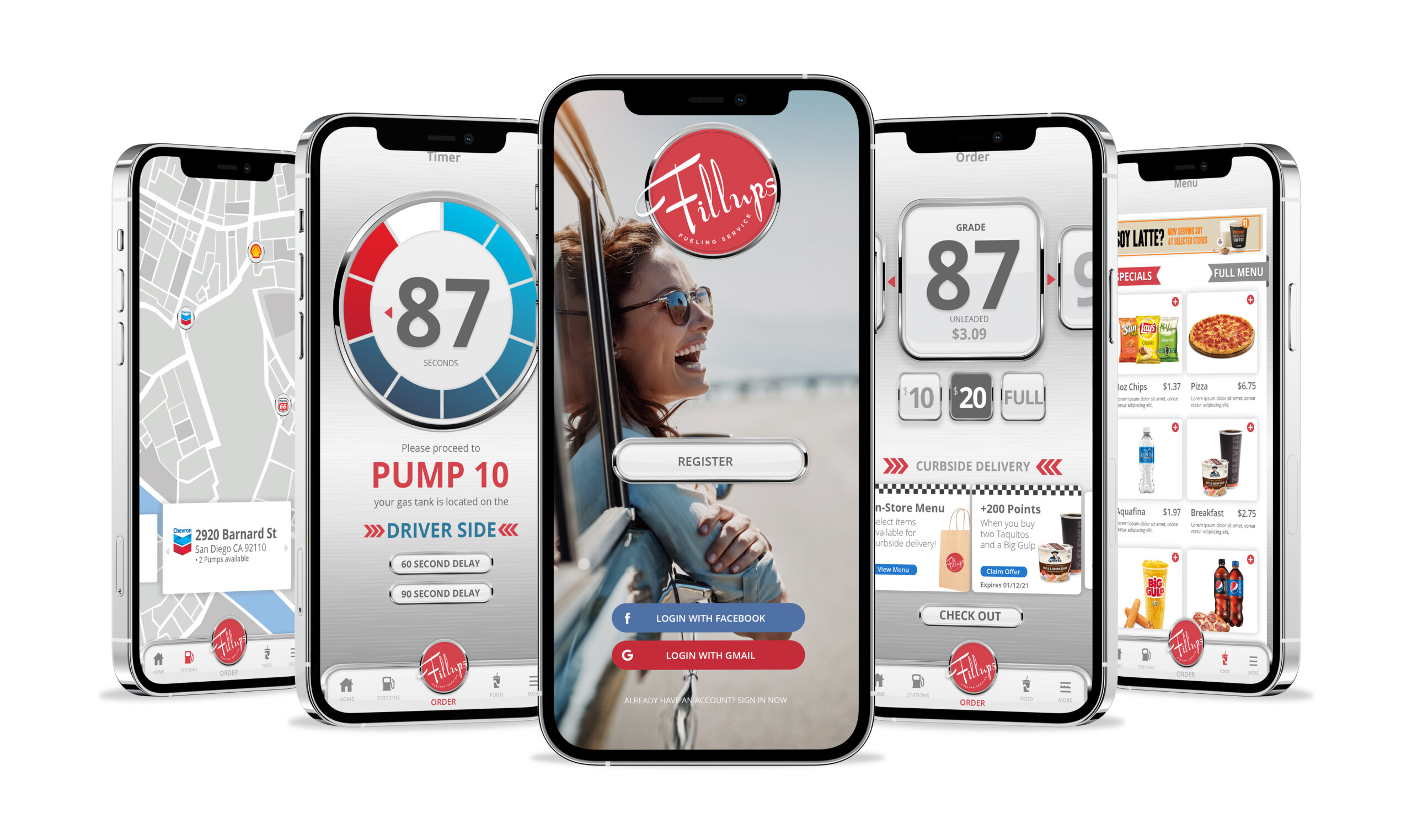
Great apps don’t just look good—they work effortlessly. For Fillups, we applied tried-and-true UI/UX principles to create an interface that’s both attractive and functional. High-contrast visuals improve readability in bright outdoor settings, large touch targets cater to drivers on the go, and progress indicators reduce uncertainty throughout transactions. Every pixel was designed with intention, balancing aesthetic appeal with performance. We believe great design is invisible when done right—something Fillups users experience every time they open the app.
To capture the spirit of “the good old days,” our team crafted a series of mood boards that transported the client—and eventually the user—back to the golden era of full-service gas stations. Inspired by 1950s Americana, we curated visuals that blended bold chrome accents, checkered flooring patterns, retro typography, and a red-and-silver palette reminiscent of vintage signage and service uniforms. This nostalgic vibe became the cornerstone of the Fillups brand—striking a unique balance between modern convenience and classic charm. The result is an app experience that feels instantly familiar, friendly, and fun.
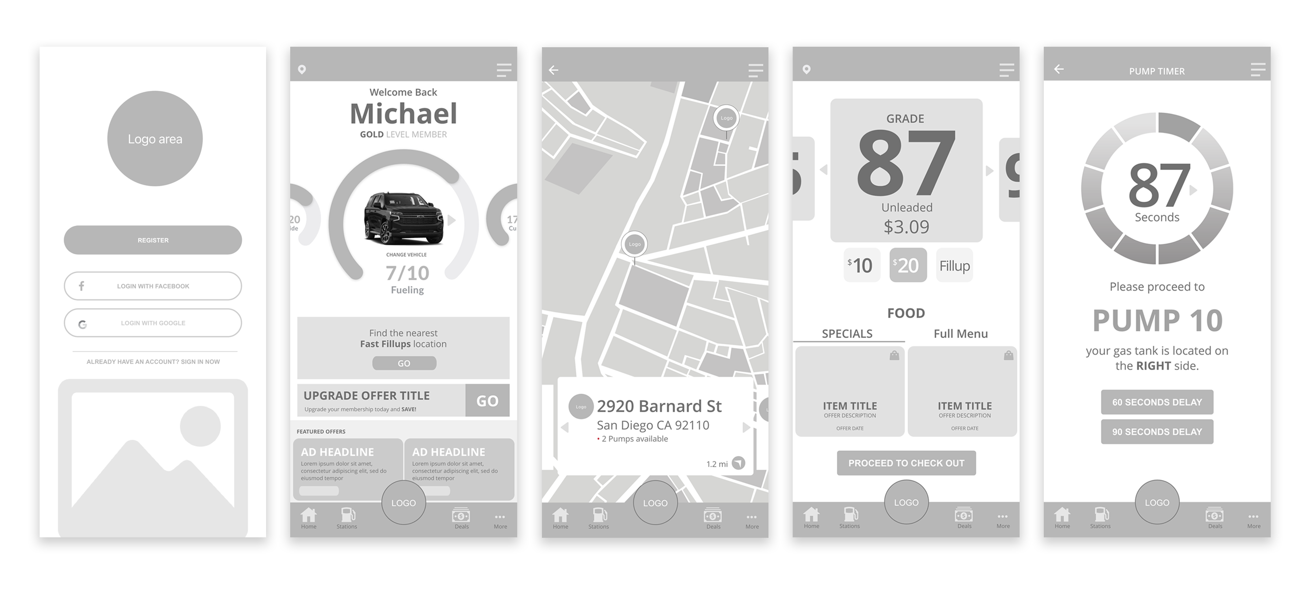
Before diving into design, we built a complete wireframe set to ensure the user experience was seamless from start to finish. The wireframes mapped out every core interaction—from logging in, to finding a nearby station, to ordering food or fuel, to completing payment—all designed to minimize taps and maximize clarity. By focusing on the journey first, we were able to stress-test logic, refine functionality, and speed up stakeholder alignment. The approved wireframes became our blueprint for both the UI and development teams, accelerating the transition from concept to production.
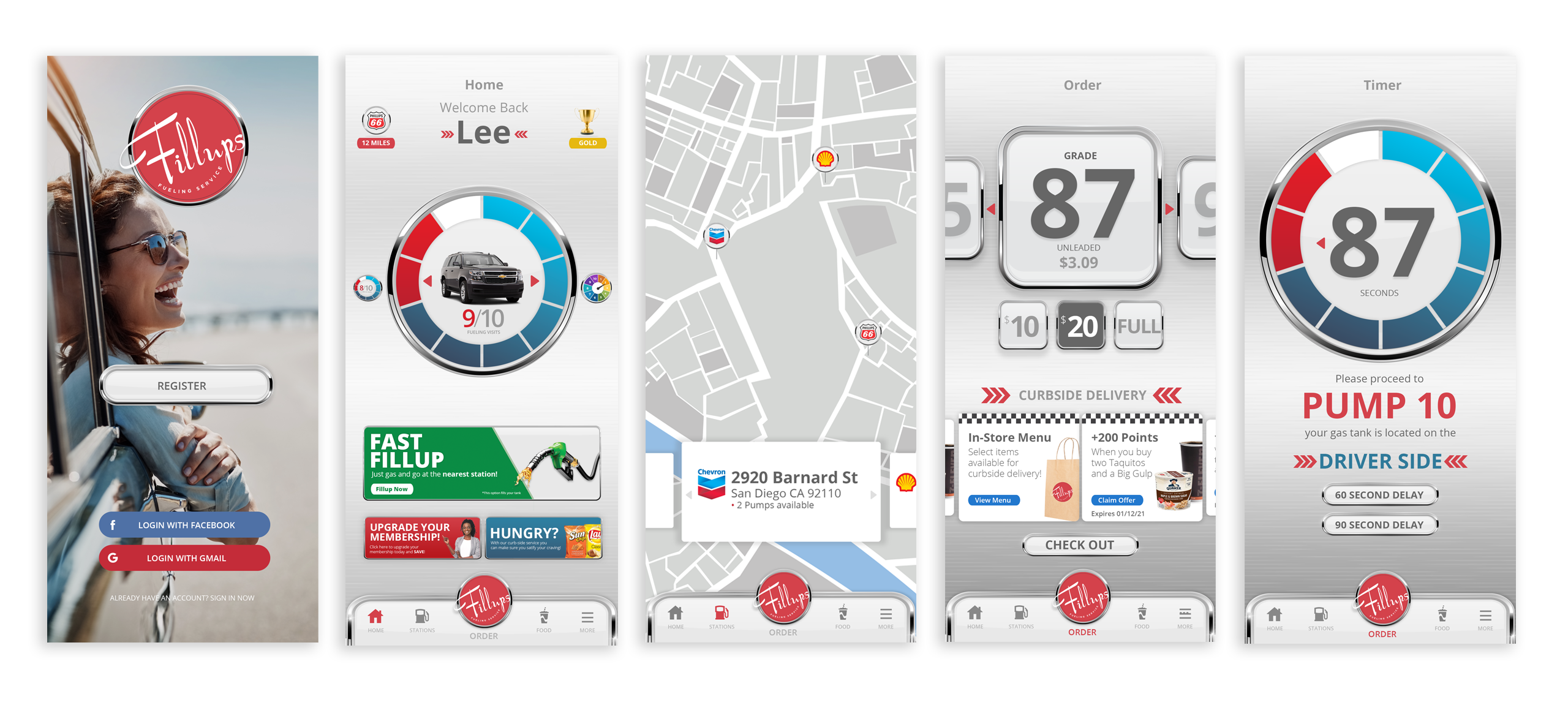
The Fillups app is built around intuitive, friction-free user journeys. Starting from a personalized dashboard, users can quickly find nearby locations, order fuel, select food items, or manage payments. Each step in the flow is optimized for simplicity—guiding users with clear calls-to-action, visual feedback, and consistent navigation. Whether a user is topping off their tank or redeeming a food offer, the experience feels logical and well-paced. Our team worked closely with stakeholders to ensure these journeys reflected real-world use cases, making sure every screen served a purpose.
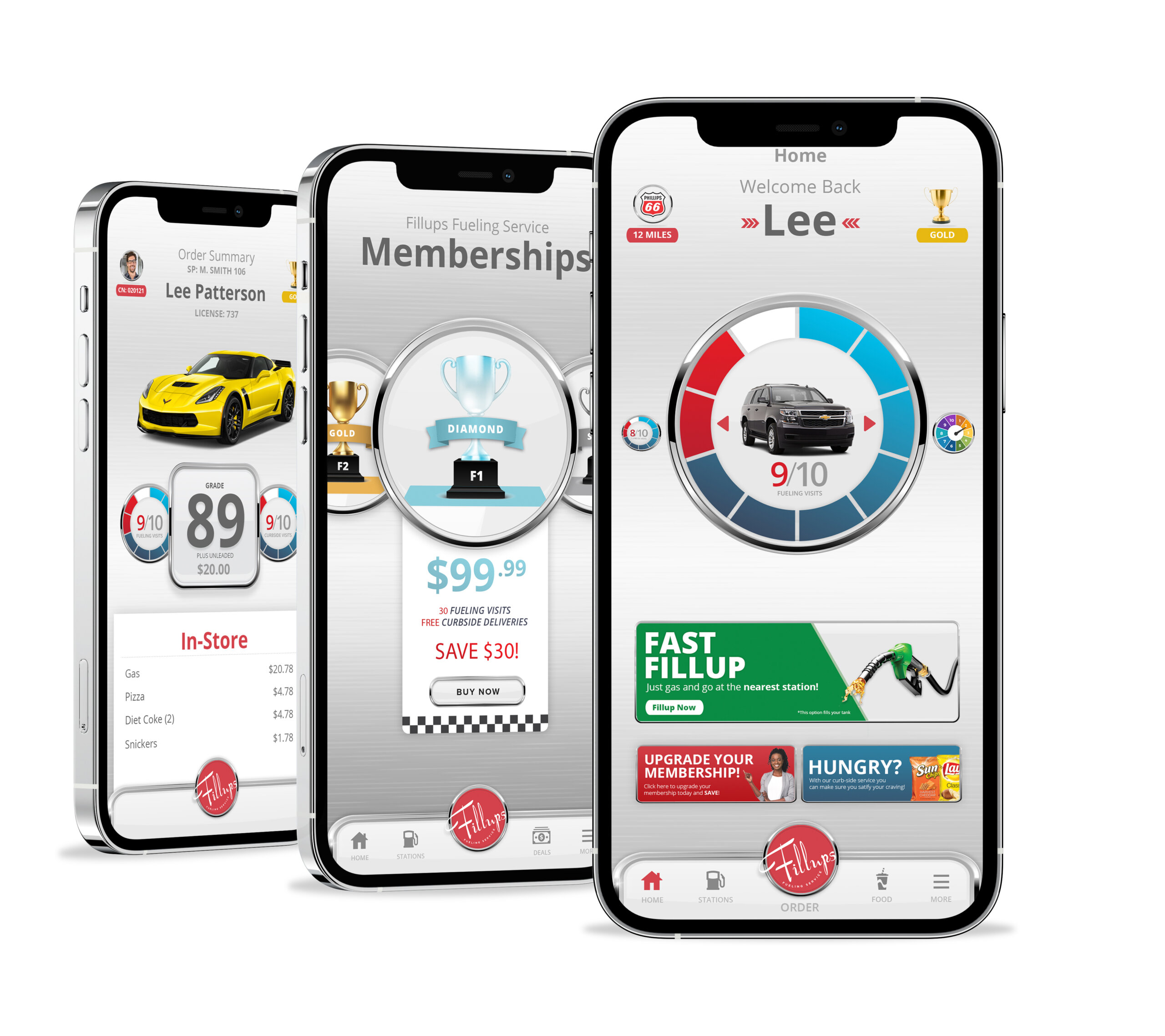
The Fillups app wasn’t just designed to look great—it was engineered to perform under real-world conditions. From high-contrast screens that stay readable in bright sunlight to large, thumb-friendly buttons that are easy to tap on the go, every detail was crafted with usability in mind. We considered the context of use at every stage—busy drivers, quick stops, and limited attention spans. By blending thoughtful UI decisions with reliable performance, we created an experience that’s fast, intuitive, and genuinely helpful when users need it most.
RocketDog is a creative agency blending strategy, design, and smart use of AI to help brands stand out, connect, and grow.
SEATTLE
1700 Westlake Ave N. #200
Seattle WA 98109
SAN DIEGO
600 B St,
San Diego, CA 92101
Get fresh insights, tips, and creative inspiration from RocketDog—straight to your inbox.